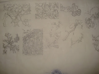
I started with these cuts and drawings but... i didnt know what the fuck I was doing.


Then from those... i did some marquettes and this is the first one
But its a little bit too... structures and cells are not structured. and i could do one big piece nd have a tab in the back
then i did more marquettes.
Then the next marquette is


 The problem that i found out was that it wasnt equal on top sooo if i was going to put a shape in the middle to hold up the light bulb... its a problem.. and the problem in the bottom is that... it doesnt stand evenly... its tilted
i like it when compositions are balanced... i mean... this could be balanced if its a 2d piece but its not balanced for 3d... like as a design and the standing of it.
so this is how the the last one came to be


 the dark lines and medium shade line and the light mean... the light and med and dark vectors that i will be putting on it to give the 3 d look. and if it doesnt show during the light on.. its fine but when its off... you can see that.
 a good lamp has good designs while on or off...
this is what it looks like when its lid up


No comments:
Post a Comment